Flint & Bloom — Shopify Fashion Store, Brand System & Navigation
Shopify · E-Commerce · Brand Direction · Information Architecture · SEO

FashionStore23 to enter
Flint & Bloom is a Shopify development store created to explore how a premium, EU-sourced fashion proposition could be translated into a coherent e-commerce brand and shopping experience.
The work extended beyond configuring a theme. It included brand positioning, visual identity, catalogue organisation, seasonal merchandising, navigation planning, product presentation and search-focused content.
The project developed through several design iterations. An early version explored a broader men’s and women’s fashion proposition. The refined direction focused more clearly on women’s clothing, accessories and seasonal collections, supported by a more consistent visual system and scalable website structure.
Project Overview
Project detail | Description |
Project type | Shopify development store and portfolio project |
Sector | Women’s fashion and accessories |
Platform | Shopify |
My contribution | Brand direction, website design, catalogue organisation, navigation, merchandising, product presentation, content and SEO |
Business model explored | EU-sourced fashion catalogue with fulfilment handled through supplier relationships |
Primary audience | Style-conscious customers seeking accessible European fashion and seasonal wardrobe choices |
Project status | Development store; no live sales or performance results are claimed |
Core focus | Creating a visually coherent, easy-to-navigate fashion store capable of supporting a substantial product catalogue |
The Challenge
The project began with a large catalogue spanning clothing, knitwear, seasonal products and accessories. The principal challenge was turning that inventory into a credible customer-facing brand rather than presenting it as an undifferentiated supplier catalogue.
The experience needed to:
Establish a recognisable premium-fashion identity.
Make a large product catalogue easier to browse.
Separate permanent product categories from seasonal campaigns.
Support product variants, colours and related items.
Give customers clear routes into new, bestselling and promotional products.
Maintain consistency across landing pages, collections and product pages.
Introduce relevant content for traditional search and product discovery.
Work across desktop and mobile layouts.
Remain manageable as new products and collections were added.
The project also required a clearer commercial focus. Early concepts included both men’s and women’s fashion and presented the store partly as a ready-made business. The later design narrowed the customer proposition and developed a more distinctive women’s-fashion identity.

Objectives
Objective | Intended outcome |
Create a clear brand proposition | Position Flint & Bloom as a curated fashion store rather than a generic product catalogue. |
Improve product discovery | Help customers reach relevant products through collections, seasonal routes and clear category labels. |
Develop a scalable structure | Create an information architecture capable of supporting a growing catalogue. |
Strengthen visual consistency | Apply a shared palette, typography system, image treatment and interface style. |
Support merchandising | Surface new arrivals, seasonal products, bestsellers, promotional collections and related items. |
Improve search readiness | Add collection descriptions, metadata and editorial content aligned with relevant customer searches. |
Demonstrate Shopify capability | Show practical experience across store configuration, catalogue presentation, navigation and content management. |
Brand Direction
The Flint & Bloom identity was developed around the idea of timeless European style presented through a contemporary digital storefront.
The final positioning was:
Stylish Italian fashion for every season
The supporting proposition combined:
Timeless style and modern wardrobe essentials.
Curated products sourced from Europe.
Women’s clothing and complementary accessories.
Seasonal edits rather than an undirected catalogue.
A polished but accessible visual identity.
Clear reassurance around shipping, returns and collection quality.
The brand system uses fashion-led editorial typography alongside restrained colours and generous spacing. This creates a more premium presentation without making the store feel inaccessible.

Style Guide
Colour Palette
Colour | Hex value | Application |
Slate Navy | #354A5F | Primary brand colour, navigation and major panels |
Dusty Rose | #E9D4DD | Soft accent areas and campaign details |
Soft Copper | #B37C58 | Buttons, CTAs and selected highlights |
Warm Stone | #D9D1C8 | Neutral backgrounds and supporting surfaces |
Ivory White | #F8F9FA | Main interface background and light UI |
Charcoal | #2B2B2B | Primary body text |
Muted Gold | #C9A96B | Premium highlights and decorative details |
Soft Grey | #E9ECEF | Borders, dividers and secondary UI elements |
The palette was chosen to complement seasonal product photography while keeping the surrounding interface neutral. Slate navy provides continuity across the store, while dusty rose, copper and muted gold introduce warmth without competing with product colours.
Typography
Typeface | Use |
Cormorant Garamond | Large headings, editorial statements and collection titles |
Cinzel | Subheadings, campaign labels and selected brand details |
Open Sans | Navigation, body copy, product information and interface text |
Cormorant Garamond provides the fashion-editorial character, while Open Sans maintains clarity within functional shopping areas. Cinzel acts as a restrained bridge between the two.
Visual Language
The visual system combines:
Large editorial headings.
Product-led photography.
Generous white space.
Restrained navigation and controls.
Neutral backgrounds that allow clothing colours to remain prominent.
Slate-navy panels for emphasis.
Seasonal campaign imagery.
Consistent button, label and product-card treatments.

Information Architecture and Navigation
A revised sitemap was developed to separate product type, seasonal intent, promotional content and customer-support information.
Primary Navigation
Navigation group | Example destinations |
New In | Latest Arrivals, Trending Now, New This Season |
Clothing | Dresses, Tops and Blouses, Knitwear, Coats and Jackets, Two-Piece Sets, Bottoms, Loungewear |
Accessories | Hats and Scarves, Bags and Wallets, Belts, Jewellery, Gloves, Hair Accessories |
Seasonal | Autumn Collection, Winter Collection, Spring Collection, Summer Collection, Occasion Wear |
Sale | Clothing Sale, Accessories Sale, Seasonal Sale, Last Chance |
About | Our Story, Sustainability, Size Guide, Shipping and Returns, FAQs |
Contact | Contact Form, Customer Support, Newsletter Sign-up |
Supporting routes include Search, Account, Cart, Checkout, Privacy Policy, Terms and Conditions, Cookie Policy and GDPR information.
This structure allows customers to browse in several ways:
By product type.
By season.
By what is new.
By promotion or sale status.
By wardrobe occasion.
Through search and account functions.
The resulting hierarchy is broader than the simplified Home / Catalogue / Contact navigation shown in some development screenshots. The simplified navigation represents an earlier implementation stage; the sitemap shows the proposed scalable structure for a fuller store.

Navigation Decisions
Separating Products from Seasonal Merchandising
Permanent categories such as knitwear, dresses and accessories were separated from campaign-led routes such as Autumn Collection and New This Season.
This prevents the navigation from depending entirely on temporary campaigns and allows seasonal content to change without disrupting the underlying catalogue.
Supporting Different Shopping Behaviours
The navigation recognises that customers may arrive with different intentions:
Customer behaviour | Supporting route |
Looking for a specific product | Clothing or Accessories |
Browsing the latest additions | New In |
Shopping for the current season | Seasonal |
Searching for reduced products | Sale |
Requiring reassurance | About, Shipping and Returns, FAQs |
Returning to complete a purchase | Account, Cart and Checkout |
Reducing Ambiguous Labels
Early navigation used labels such as More, which concealed important categories. The proposed structure replaces this with descriptive top-level labels that communicate what customers will find before they interact.
Shopify Store Build
The Shopify store was configured to demonstrate a complete customer journey from campaign landing page to collection, product selection and cart.
The catalogue grew to include hundreds of product listings across clothing and accessories. This made consistency especially important across titles, imagery, variants, pricing and collection assignments.
Store Areas Developed
Area | Work completed |
Homepage | Campaign-led hero content, brand proposition, category entry points and product merchandising |
Collections | Product grids, availability and price filters, sorting and alternate grid views |
Product pages | Image galleries, colour variants, sizing, quantity controls, descriptions and purchase actions |
Seasonal landing pages | Autumn and winter discovery, new-season edits and featured products |
Merchandising | New arrivals, bestsellers, sale products and complementary product recommendations |
Customer reassurance | Shipping, returns and curated-collection messages |
Store utilities | Search, customer account, currency selector, cart and checkout access |
Footer content | Newsletter capture and supporting policy routes |
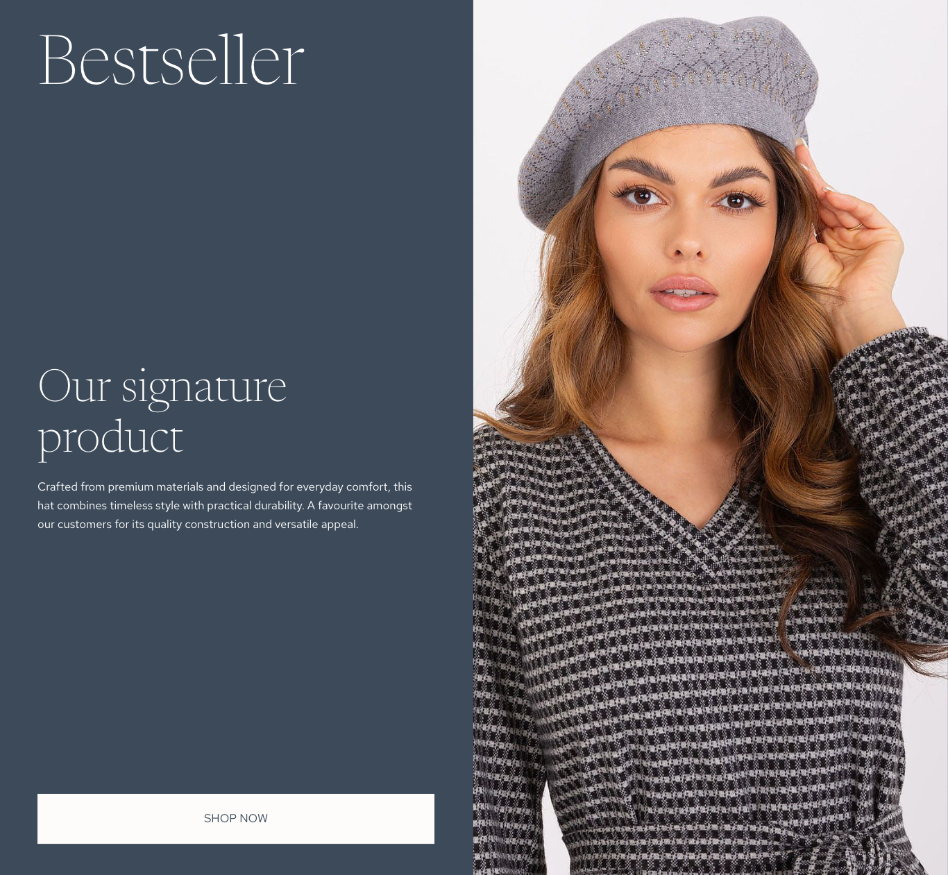
Homepage and Campaign Design
The homepage evolved from a functional Shopify layout into a more editorial fashion experience.
The revised autumn campaign uses:
A full-width fashion image.
A strong seasonal message.
A prominent Shop New Collection CTA.
Clear access to New In, Clothing, Accessories, Seasonal and Sale.
Supporting reassurance covering EU-sourced fashion, shipping, returns and curated collections.
The purpose of the hero is not simply to create visual impact. It introduces the brand, establishes the current campaign and provides a direct route into a relevant product collection.
Below the campaign, product modules can be updated throughout the year to support new arrivals, seasonal edits, bestsellers or promotional priorities.
Collection and Merchandising Experience
Collection pages were designed to prioritise product imagery while retaining the controls customers need to narrow larger ranges.
Key features include:
Availability filtering.
Price filtering.
Product counts.
Sorting controls.
Grid-view options.
Visible colour variants.
Sale indicators.
Consistent product naming and pricing.
Seasonal and product-type headings.
The seasonal landing pages also provide curated routes into related categories. For example, the Autumn and Winter page brings together jumpers, boots, hats and scarves, gloves, coats and jackets within one campaign-led experience.
This creates a bridge between brand storytelling and practical catalogue navigation.

Product-Page Experience
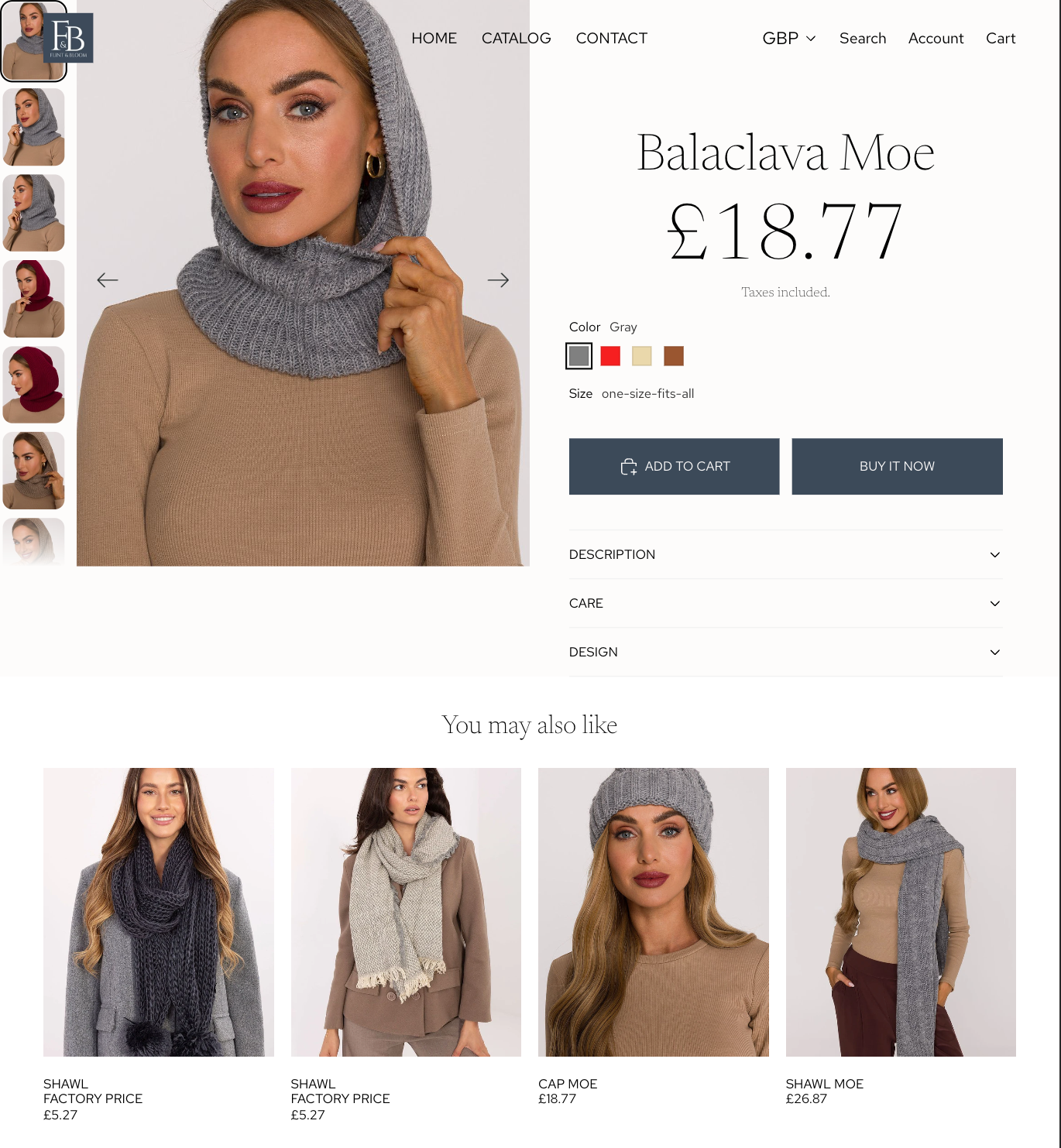
The product-page layout combines visual product exploration with the information and actions required to make a purchase decision.
Product-Page Components
Component | Purpose |
Image gallery | Shows the product, colours and styling from multiple angles |
Product title and price | Establishes the core purchase information |
Colour variants | Allows customers to compare available options |
Size selection | Communicates variant availability |
Add to Cart | Supports continued browsing |
Buy It Now | Provides a faster purchase route |
Description | Explains the materials, fit, design and product benefits |
Care information | Helps customers understand product maintenance |
Related products | Encourages further discovery across the range |
Shipping and returns | Reduces uncertainty before purchase |
The screenshots show the progression from a standard Shopify presentation to a more visually controlled product-detail layout with clearer hierarchy, restrained controls and supporting recommendations.
Content and SEO
Content was created to support both customer understanding and organic discovery.
This included:
Collection introductions.
Product descriptions.
Page titles and meta descriptions.
Seasonal campaign copy.
Customer-reassurance messages.
Blog planning around EU-sourced fashion and inventory-light e-commerce.
Internal links between related products, collections and editorial content.
One example was the New Arrivals collection, positioned around weekly product updates, European sourcing, current silhouettes and seasonal wardrobe needs.
Two longer editorial themes were also developed:
Why European Dropshipping Fashion Brands Are Winning in 2025
How to Start a Fashion Brand Without Inventory — The EU Dropshipping Advantage
The content explored customer and commercial themes including product quality, fulfilment, shipping expectations, inventory risk and the role of a coherent brand.
No rankings, traffic improvements or sales results are claimed. The value of this work lies in demonstrating how search considerations can be incorporated into an e-commerce structure from the outset.
(Placeholder image — use a three-panel visual containing a collection description, example metadata and one editorial-content outline.)
Key Design Decisions
Decision | Reasoning |
Narrow the proposition toward women’s fashion | Creates a clearer audience and more coherent catalogue presentation. |
Use an editorial serif for major headings | Gives the brand a fashion-led identity without affecting interface readability. |
Retain a neutral supporting interface | Keeps attention on product photography and seasonal colour. |
Separate permanent and seasonal categories | Allows campaigns to change without rebuilding the underlying catalogue. |
Show product variants within collection cards | Communicates choice before customers enter a product page. |
Support direct and exploratory shopping | Combines search, categories, campaigns, recommendations and product filters. |
Add practical reassurance near key decisions | Addresses delivery, returns and product-curation concerns at relevant points. |
Create reusable page patterns | Maintains consistency as new products, collections and campaigns are introduced. |
Outcomes
The project produced a complete Shopify fashion-store concept supported by a coherent brand and information architecture.
What the Work Demonstrates
End-to-end Shopify store configuration.
Brand development applied to a working e-commerce environment.
Management and presentation of a substantial product catalogue.
Collection planning and digital merchandising.
Responsive homepage, collection and product-page design.
Product-filtering and variant presentation.
Seasonal campaign development.
Customer-journey and navigation planning.
Collection content, metadata and editorial SEO.
Iterative improvement from an early store layout to a more considered brand experience.
Important Context
Flint & Bloom is a development and portfolio store. The work demonstrates design, e-commerce and content capability, but it does not claim live sales, conversion improvements or independently verified supplier performance.
(
Placeholder image — use a four-image gallery showing the homepage, seasonal landing page, collection grid and product page.)
Deliverables
Shopify development store.
Flint & Bloom logo and brand direction.
Colour and typography system.
Homepage and campaign layouts.
Responsive store presentation.
Proposed website sitemap.
Product and seasonal collection structure.
Collection and product-page templates.
Product filters and variant displays.
New-arrival and bestseller merchandising.
Customer reassurance content.
Collection descriptions and metadata.
Editorial SEO content.
Supporting portfolio visuals.
Tools and Methods
Area | Tools and methods |
Platform | Shopify |
Brand development | Moodboarding, colour system, typography and image direction |
Information architecture | Sitemap development, category hierarchy and navigation planning |
Merchandising | Collections, seasonal edits, product cards and recommendations |
Content | Product copy, collection introductions, campaign messaging and blog planning |
SEO | Page titles, metadata, search-focused collection copy and internal-link planning |
Evaluation | Iterative visual review across homepage, collection and product-page templates |
Reflection
Flint & Bloom demonstrates how a Shopify build becomes more effective when brand, navigation, merchandising and content are developed as one connected system.
The strongest improvement was the move away from a broad product-led catalogue towards a more focused customer proposition. Establishing a defined visual identity and a scalable sitemap made it easier to understand how products, seasonal campaigns and supporting content should work together.
The project also reinforced the importance of catalogue governance. A store containing hundreds of products requires consistent product titles, imagery, collection assignments, variant information and descriptions. Without that structure, even a visually attractive store can become difficult to browse and maintain.
If the store were developed for commercial launch, the next stage would include supplier verification, accessibility testing, structured usability testing, analytics configuration, technical SEO validation and conversion testing using real customer behaviour.