Glowmere — Luxury Vegan Skincare
Shopify · Ecommerce · Brand Development · Product Design · Social Content
Project overview
Glowmere is a luxury skincare brand built around vegan, cruelty-free and botanically led formulations. The project transformed a collection of white-label skincare products into a coherent consumer brand with its own identity, packaging architecture, ecommerce experience and social presence.
I developed a complete visual and commercial system that communicated premium quality while retaining the warmth, accessibility and natural character expected from an ethical skincare brand. The work extended from the initial brand direction and product presentation through to the live Shopify storefront, launch campaigns, Instagram content and supporting editorial material.
The challenge
White-label skincare can easily feel generic when products are presented without a distinctive point of view. Glowmere therefore needed more than attractive packaging: it required a recognisable brand story capable of connecting its products, ethical credentials and customer experience.
The identity had to balance several qualities:
Premium without appearing inaccessible
Botanical without becoming rustic
Ethical without feeling overly clinical
Feminine without limiting the brand’s audience
Educational without overwhelming customers with ingredient terminology
The ecommerce experience also needed to make a relatively broad product range easy to explore, particularly for customers shopping by skin type, concern or active ingredient.
Brand identity and creative direction
Glowmere’s visual identity combines editorial elegance with botanical softness. The floral “G” monogram gives the brand a distinctive signature, while Cormorant provides the expressive serif typography used across headings, campaigns and packaging. Lato Light supports this with clean, legible product information and digital interface copy.
The primary palette was built around deep plum, antique gold, muted green-grey and soft botanical neutrals:
Deep plum — #4B1E3F
Antique gold — #B29756
Green-grey — #45595A
Botanical green — #8DA384
Pale sage — #C9D3C0
Warm ivory — #E8E2DC
Soft beige — #DCCFC2
Blush neutral — #BDA9A3
Charcoal — #2C2A2A
Together, these colours allow the brand to move between luxurious campaign imagery, calm educational content and practical ecommerce interfaces without losing consistency.

Product and packaging design
Each product was given a clear packaging hierarchy that brings together the Glowmere identity, product name, key actives and formulation credentials.
Colour was used as a navigation tool across the range. The Collagen Renewal Night Cream uses a rich plum treatment to signal restorative overnight care, while the Collagen Radiance Day Cream uses a deep botanical green. Facial oils and targeted serums use lighter ivory packaging with warm gold details, allowing the oil itself to become part of the visual presentation.
The system makes the range recognisable as one family while giving each formula enough individuality to be identified quickly in product grids, campaign images and social content.
Product photography was styled using pale stone, softly lit surfaces and botanical settings. This creates a bridge between clinical product clarity and the brand’s natural positioning.

Ecommerce experience
The Shopify storefront was designed as a layered brand and shopping experience rather than a simple product catalogue.
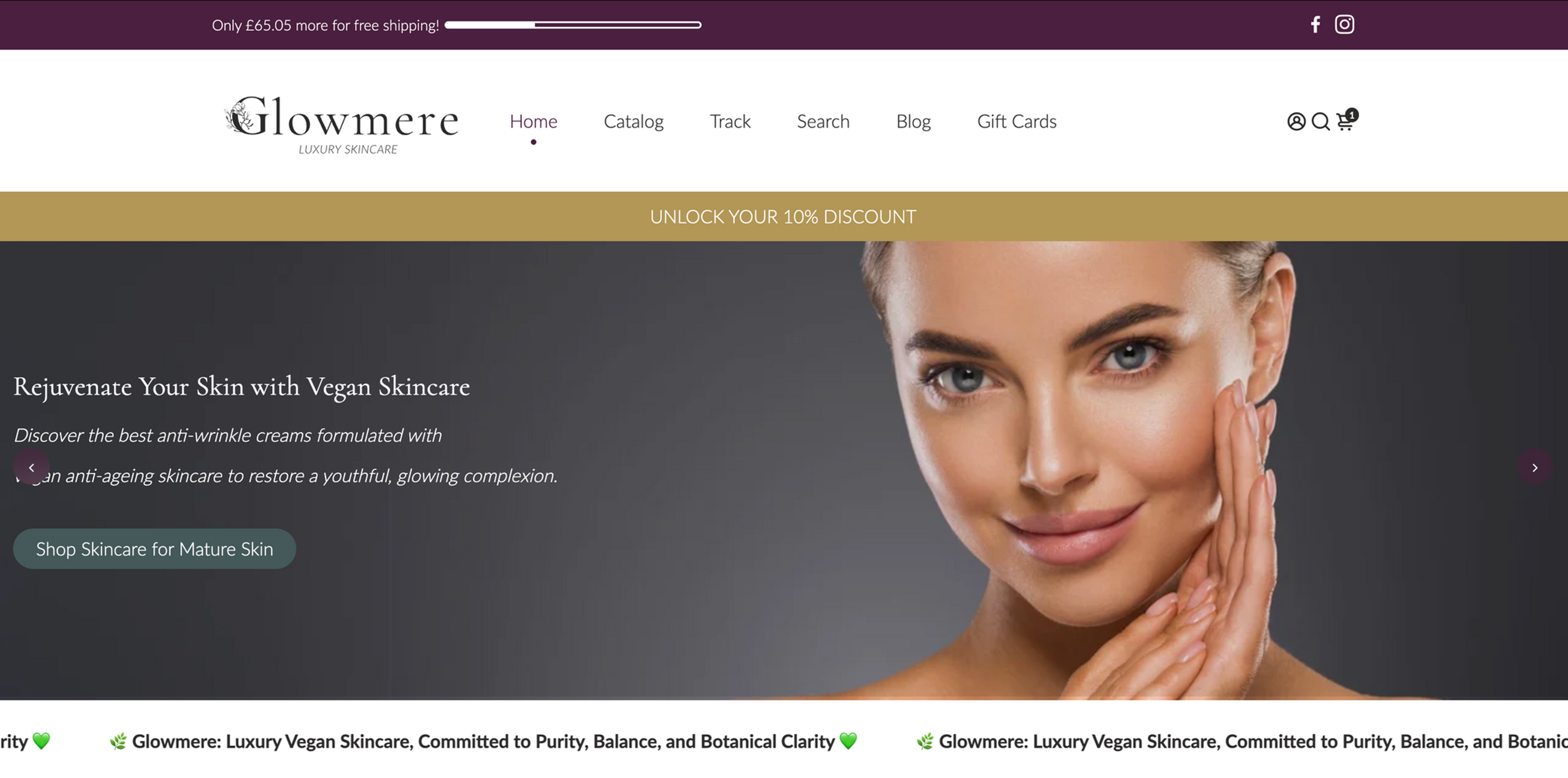
The homepage introduces Glowmere through a strong skincare-led hero image before moving into a seasonal campaign, product discovery and social proof. Its content structure combines:
Campaign-led hero content
Seasonal sale messaging
Product cards and quick-purchase actions
Customer testimonials
Featured-product storytelling
Vegan, plant-based and COSMOS certification signals
Email acquisition
Educational articles
Instagram-inspired brand imagery
Frequently asked questions
This hierarchy allows visitors to understand the brand, assess its credentials and begin shopping without being confronted by too much information at once.

Collection discovery
The collection page supports product discovery through filters for product type, skin type, concern, ingredient and formulation benefit. Promotional pricing, sale markers and consistent purchase controls make seasonal offers easy to understand without distracting from the premium positioning.
Product cards use a consistent photographic format and clear information hierarchy. Customers can compare products, review promotional pricing and add items to their basket directly from the collection.
Product detail and conversion
The product page balances purchasing information with education and reassurance. Its primary panel combines product photography, pricing, quantity controls and purchasing options with expandable sections for:
Product descriptions
Full ingredients and certifications
Application guidance
Shipping information
Skin-type and ingredient tags
Further down the page, alternating editorial panels explain why the product is distinctive, its main benefits and the customers or routines for which it is best suited.
Cross-selling and routine-building sections encourage customers to understand each formula as part of a wider skincare ritual rather than as an isolated purchase.

Editorial and search-led content
Glowmere Insights was developed as the educational layer of the brand. Its content translates ingredient information and product benefits into approachable articles covering subjects such as:
Natural alternatives to retinol
Facial oils for dull or dry skin
Sensitive-skin routines
Vegan skincare
Collagen day and night care
Moisturisers for redness
Ethical skincare and affiliate opportunities
This content supports organic discovery while reducing uncertainty around ingredients such as bakuchiol, rosehip, marine collagen and hyaluronic acid.
The editorial system uses the same imagery, typography and colour hierarchy as the store. Customers therefore experience one continuous brand whether they arrive through a product page, educational article, campaign or social post.

Instagram and campaign creative
A flexible social system was developed to extend Glowmere beyond the storefront. The work included product announcements, launch countdowns, ingredient explainers, skincare-benefit graphics, promotional posts, gift-card artwork and brand-led lifestyle content.
The creative direction combines close-up skincare photography with elegant editorial typography and a restrained use of Glowmere’s brand colours. This allows informational posts to sit naturally alongside more emotive campaign imagery.
Examples include:
Vitamin C Energising Booster ingredient artwork
Glow-Enhancing Facial Oil campaign content
“Luxury Vegan Skincare” promotional creative
“Glow with balance. Glow with care.” brand artwork
Product launch and countdown posts
Vegan and organic skincare messaging
Gift-card designs
Instagram Story and Highlight assets
The system was adapted across square posts, portrait feed graphics and vertical Story formats while preserving a consistent visual identity.

Deliverables
Brand identity and botanical monogram
Colour and typography system
Product packaging and label direction
Product photography art direction
Shopify homepage design
Collection and product-page design
Seasonal campaign creative
Product benefit and ingredient content
Blog and editorial presentation
Instagram posts and Story assets
Launch and promotional materials
Gift-card designs
Trust, certification and brand-value communication
Outcome
Glowmere was developed into a complete customer-facing skincare brand rather than a collection of disconnected white-label products.
The resulting system connects packaging, ecommerce, editorial content and social media through one recognisable visual language. It gives the brand a credible premium presence while making its products, ingredients and ethical values easier for customers to understand and explore.
From the colour-coded packaging and botanical identity to the live Shopify store and Instagram campaigns, every touchpoint contributes to the same central proposition: conscious skincare presented with clarity, warmth and understated luxury.